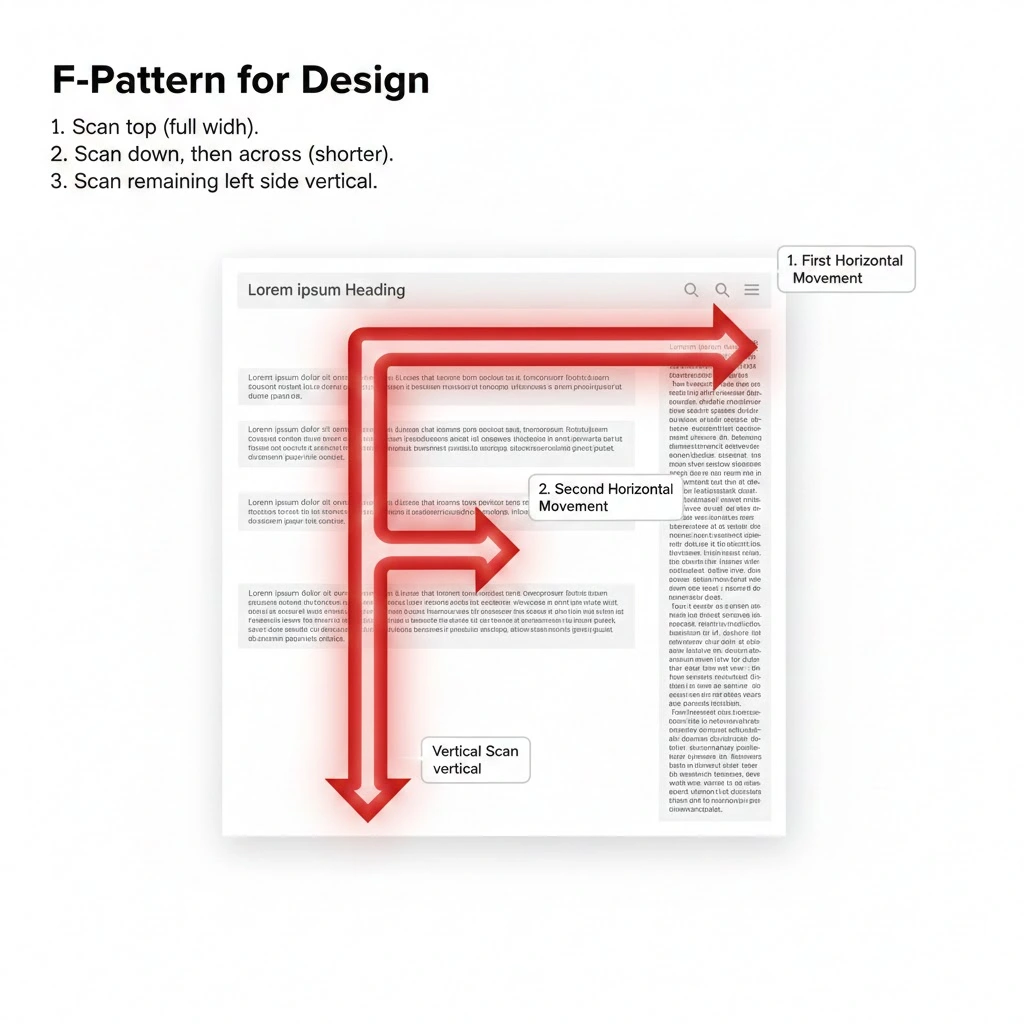
What is the F Pattern?
The F-pattern is a common design concept that describes how users typically scan text-heavy content on a screen. It’s called the “F” pattern because the user’s eye movement tends to resemble the letter F.
- First Horizontal Movement: Users typically start by scanning across the top of the content, looking for important headlines or keywords. This forms the top bar of the “F.”
- Second Horizontal Movement: After the initial scan, their eyes move down slightly and then scan horizontally again, but usually for a shorter distance than the first scan. This forms the middle bar of the “F.”
- Vertical Scan: Finally, users tend to scan vertically down the left side of the content, looking for more keywords or subheadings. This forms the stem of the “F.”
Visual Representation of the F-pattern
This scanning behavior is a result of how people read and process information, especially on the web, where they are often looking for specific information quickly rather than reading every word.
Why Is It Important for Design?
Understanding the F-pattern enables designers to optimize their layouts, ensuring that important information is visible to users. Here’s how:
- Place crucial information at the top: Headlines, calls to action, and primary navigation should be in the areas where users are most likely to look first.
- Use strong headings and subheadings: These break up text and make it easier for users to scan vertically down the left side.
- Keep paragraphs concise: Long blocks of text are often skipped.
- Utilize bullet points and lists: These are easy to scan and highlight key information.
- Prioritize content placement: Place the most important content along the “F” shape.
Does the F Pattern Work Always?
While the F-pattern is a widely documented and often effective model for understanding user scanning behavior, it does not always work or in every scenario.
The F-pattern is primarily observed on content-heavy pages where the user’s goal is to scan and find specific information quickly (e.g., blog posts, search results, or article pages).
When the F-Pattern is Less Likely
The F-pattern tends to break down or evolve when the page layout or user intent changes.
- Goal-Oriented Tasks: If a user is highly motivated to complete a specific task (e.g., filling out a form, checking out a cart, or using an interactive tool), they are more likely to follow a Z-pattern or a visual hierarchy designed to guide them through the steps, rather than just scanning for keywords.
- Visually Dominant Layouts: On pages with minimal text and heavy reliance on large images, videos, or graphic elements (common on modern landing pages and portfolios), users will often be drawn to the visuals first. Their scan might follow a zigzag or Z-pattern across the main image areas and then down to a Call-to-Action (CTA).
- Shorter/Simple Content: If a page has very little content, just a main headline, a short paragraph, and a big button, users don’t need to default to scanning. They will read everything on the page, and the F-pattern won’t be applicable.
- Centralized or Grid Layouts: When all content is centered, or information is presented in a multi-column, balanced grid, the vertical “stem” of the F-pattern is less defined. The user’s eye might jump between prominent elements in the center of the page.
Best Practices for Design
Instead of relying solely on the F-pattern, contemporary design often focuses on a more adaptable principle: Visual Hierarchy.
- Design for Scanning (Not just F-pattern): Recognize that users are always scanning. Use techniques like bolding key terms, using clear subheadings, and bulleted lists (all of which work well with the F-pattern) to make your content digestible regardless of the exact path the eye takes.
- Prioritize the “Above-the-Fold” Area: The top-most part of the page is always the most important, as it is the first area seen. This principle remains true whether it’s an F, Z, or any other pattern.
- Leverage the Left Side: Users in Western cultures still read left-to-right, making the left column a priority area for navigation, subheadings, and quick summaries.
Ultimately, the F-pattern is a great starting point for understanding text-heavy web design, but effective design requires testing and adapting the layout to the specific user goal and type of content.
Sources:
- https://www.writearm.co.uk/news/what-is-the-f-pattern-and-how-can-it-improve-your-copywriting/
- https://medium.com/uxd-critical-software/understanding-the-f-shaped-and-z-shaped-reading-patterns-for-optimal-usability-in-complex-systems-e96668839abd
- https://www.medway.gov.uk/info/200867/content_patterns
- https://eliteseoconsulting.com/encyclopedia/f-pattern/
- https://news.delta.ncsu.edu/2024/05/28/effective-use-of-bulleted-lists/
- https://cxl.com/blog/10-useful-findings-about-how-people-view-websites/
- https://hdsquares.com/f-pattern-web-design-the-invisible-force-shaping-user-behavior/
- https://brimaronlinemarketing.com/blog/what-is-the-role-of-visual-hierarchy-in-high-converting-web-design/