Lazy Loading
What is Lazy Loading?
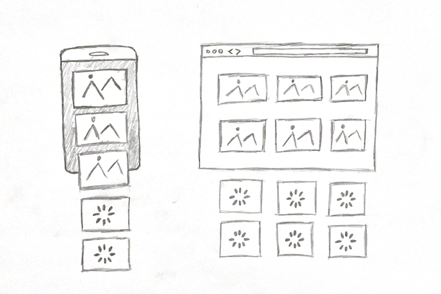
Basically, lazy loading is a technique for late loading of the images, video or iframe resources used on the pages, out of the visible screen, to increase the performance of web pages.
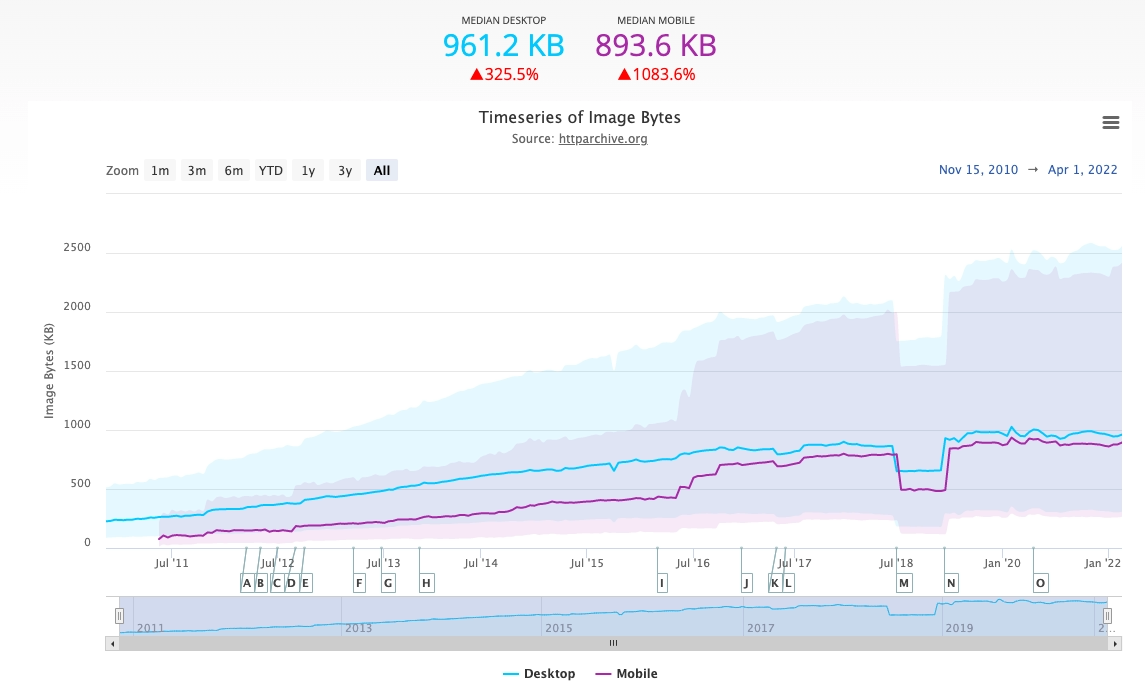
Each of the resources used in web pages creates a load on the page, according to HTTPArchive images are the most popular resource on websites. Since they use more images, they use more bandwidth than other sources.
Over the years, the load of images used on the pages has been increasing.
As the load on the page increases, the performance of the web pages is affected by this situation, loading only the images that appear on the screen at the time of loading the page and delaying the invisible images always contribute to data savings and performance gain.
Google’s Page Speed Insight Tool and some third-party tools warn that off-screen images should be delayed on websites.

Warning to delay loading of off-screen images on Google Page Speed Insight
Note: The loading of the images that will appear on the first loading screen of the page should not be delayed, when these images are delayed, the performance of the page also decreases. Since the main purpose is to make the page load fast, offscreen images should be delayed, not the first images on the viewport to be loaded.
Lazy Loading For Videos
Video elements such as visual elements can also be delayed. Videos are usually uploaded with the <video> tag. (In some cases, there are cases where <img> tags are used.)
To delay videos, preload="none" is added to the video tag to prevent preloading of video data. Although it varies according to the browsers, since the preload feature is specified as auto in some browsers by default, video data can be preloaded, to prevent this, the preload feature is marked as none.
For the videos that will be started with the click of the user, the preview image is indicated by the poster feature until the video is uploaded.
<video controls preload="none" poster="preview.jpg">
   <source src="..." type="video/webm">
   <source src="..." type="video/mp4">
</video>
Native Lazy Loading
Along with the native lazy loading loading="lazy" feature that comes with the Chrome 77 update released on September 16, 2019, images (<img>) and iframe (<iframe>) tags are delayed.
With this feature, there is no need to write special delay code or use a third-party Javascript library.
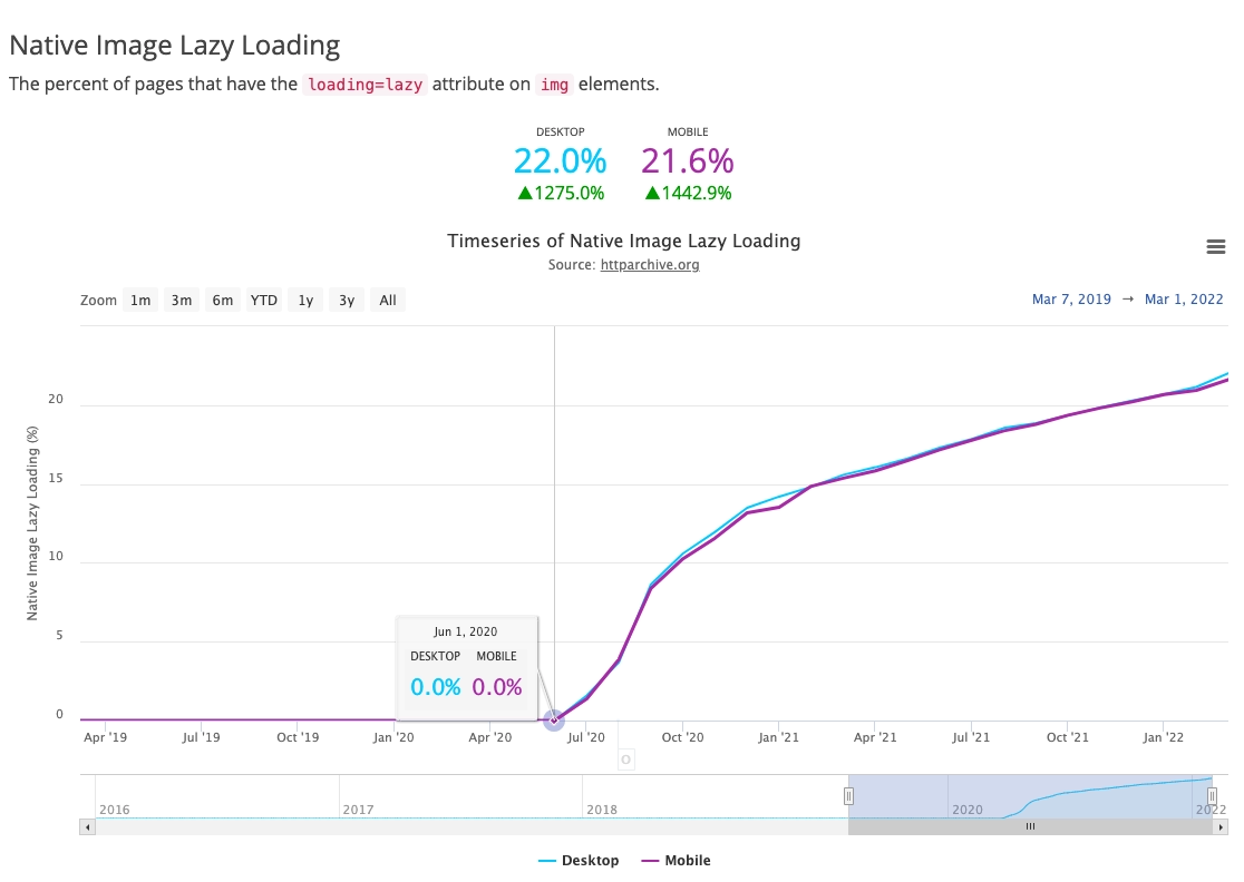
It is seen that the usage rate of native lazy loading has increased over time.
In the delay method implemented with the loading="lazy" feature, it works even if the user disables Javascript and there is no need for third party libraries.
Using Native loading="lazy" In Images
Off-screen images are delayed with the following usage, which comes with Chrome 77 and is also applied in later versions.
<img src="..." alt="..." loading="lazy" width:"..." height:"...">
Loading feature has 3 supported values;
- auto: It can be thought of as the case where the lazy-loading feature was never added. Even if it is not used because it has no function.
- lazy: The resource is delayed until the user reaches the area where the resource (image, video and iframe) is located.
- eager: It loads immediately, regardless of where the resource is on the page.
NOT: Although valid in Chromium, the auto feature is not mentioned on whatwg.org. It is not recommended to be used without passing it here, it is not a feature of extra importance anyway.
In addition, the delay feature works on images defined with the <picture> element.
<picture>
   <source media="(min-width: 800px)" srcset="large.jpg 1x, larger.jpg 2x">
   <img src="..." alt="..." loading="lazy" width="..." height="...">
</picture>
In this structure, all that needs to be done to delay the image to be captured in the <source> element is to use the loading="lazy" attribute within the <img> tag.
Note: Native lazy-loading does not work on background images used with CSS, it only works with <img> tags.
Using Native loading="lazy" in iFrame Tags
Delaying iFrame tags is used in Chromium base.
<iframe src="..." loading="lazy" width="..." height="...">iFrame lag works differently than visual lags. It varies depending on whether the iFrame tags are hidden or not. (Hidden iFrame tags are often used for analytical purposes.)
Chrome considers the following criteria when determining whether an iFrame tag is hidden;
- The width and height of the iFrame tag are less than or equal to 4px.
- Using display: none and visibility: hidden CSS on the label.
- Negatively positioned in the X and Y positions on the screen and placed off-screen.
When these situations apply, Chrome considers the iFrame tag to be hidden and does not delay the resource in most cases.
Browser Compatibility with loading="lazy"
Compatible with Chromium supported browsers. Browsers that are not compatible with the Loading attribute will ignore it without any side effects.

- Firefox only supports it for images.
- Safari supports image delays but needs to be enabled in browser settings.
Note: These data may change in the future, visit https://caniuse.com/loading-lazy-attr for updated data!
Width and Height Values of Images Must Be Specified
Browsers don’t know these dimensions right away unless the widths and heights of the images are explicitly specified.
The browser needs to know the widths and heights of the images so that they can allocate space for the images to be loaded on the pages. Therefore, the width and height values of the images should be specified.
When image sizes are not specified, it can cause layout shifts, which is more noticeable on pages with a long load time.
<img src="..." alt="..." loading="lazy" width="300" height="200">
Alternatively, it can be used as inline CSS, but inline CSS is not recommended for SEO.
<img src="..." alt="..." loading="lazy" style="width:300px; height:200px;">It is important to specify the dimensions of the images, with or without the use of lazy load. This situation becomes a little more important when using lazy loading. Specifying the width and height values also allows modern browsers to calculate the image size on the page.
Most of the time, lazy loading works even if the dimensions of the images are not specified, but in some cases it may not work.
In a case where no image dimensions are specified, the initial dimensions of the images are 0 to 0. In this way, on a page with unspecified images, the browser may decide to load everything, calculating that all the content will fit on the screen and that the user will see all the content.
Specifying the size of images reduces the occurrence of cumulative layout shifts. If the image dimensions are not provided somehow, lazy loading can create a balance between saving network resources and risking layout shift.
Lazy Load on WordPress
The Lazy Loading feature in WordPress infrastructure comes by default with WordPress version 5.5.
Frequently Asked Questions
Does the loading feature work on images added with the CSS Background feature?
No, the loading feature only works with the <img> tag.
Is there a downside to lazy loading on the viewport?
If lazy load is used in the image at the top of the screen, which the user will see during the first load, the browser cannot load this image quickly. Lazyload should not be used in the image on the first loading screen.
What if there is already a third party library or script on the site for lazy load?
When the use of native lazy load (loading=”lazy”) is fully supported on modern browsers, it can be considered to use native lazy load instead of scripts and libraries.
One reason to use a third-party library is to slow it down by using polyfills (small pieces of code) in browsers where loading is not supported.
Is lazy loading supported in <iframe> tags?
The lazy loading feature in <iframe> tags has been supported since Chrome 77.
How does the lazy loading effect on the web page affect the ads?
All displayed image or iframe elements are loaded late just like any other image and iframe.
Source
https://web.dev/browser-level-image-lazy-loading/#the-loading-attribute
https://caniuse.com/loading-lazy-attr
https://html.spec.whatwg.org/multipage/urls-and-fetching.html#lazy-loading-attributes