Website Layout Types
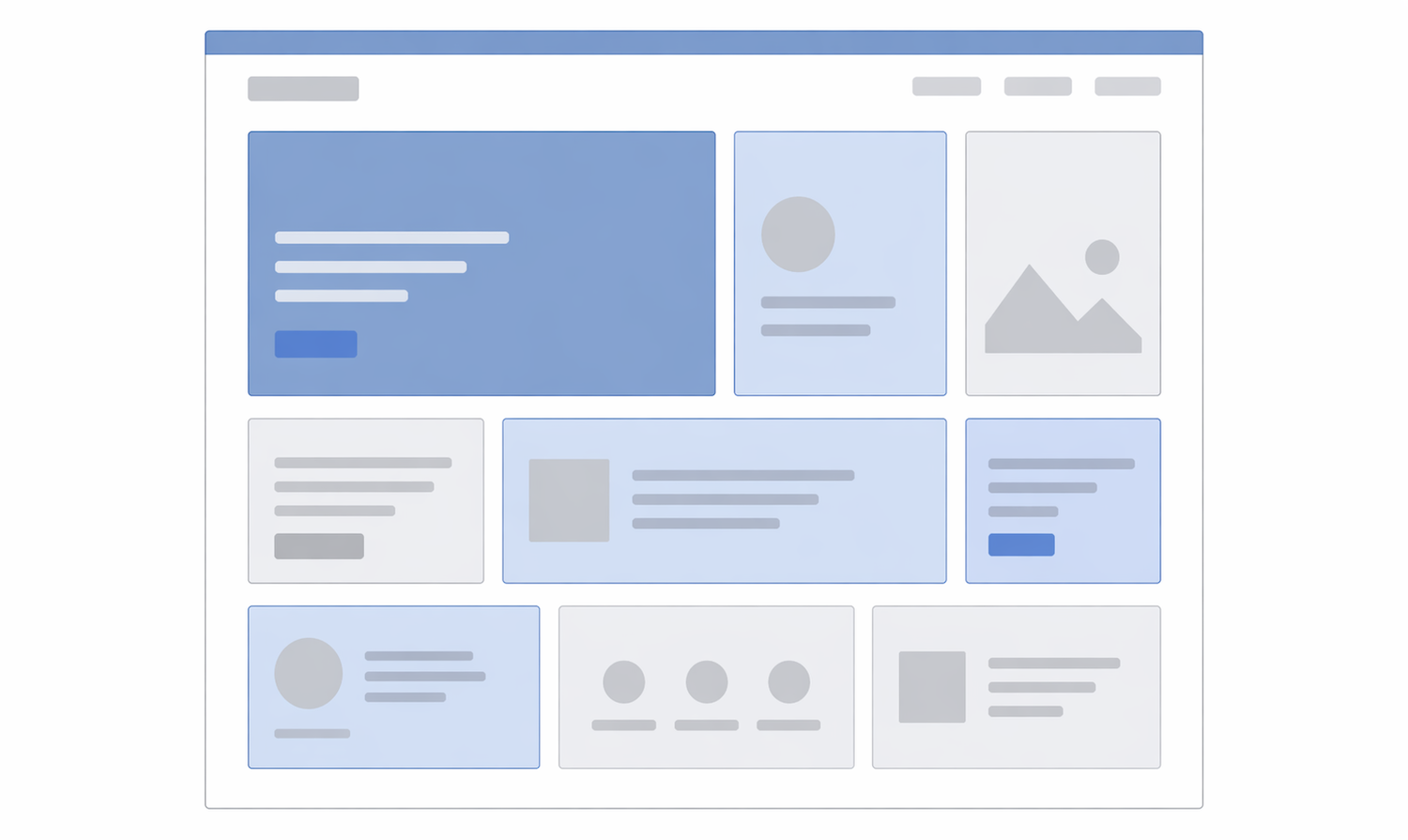
The Bento Grid
Inspired by the Japanese lunchbox, this layout uses various-sized rectangles to group content into a single, cohesive block.
- Purpose: To showcase multiple features, tools, or portfolio pieces simultaneously without the page feeling cluttered.
- Best For: Product landing pages (like Apple’s feature summaries), personal portfolios, and “Link-in-bio” style sites.
- Why it works: It feels organized, modern, and highly responsive.

The F-Pattern Layout
Based on eye-tracking studies, users scan screens in an “F” shape: top horizontal, then a shorter horizontal, then a vertical sweep down the left.
- Purpose: To cater to “skimmers” who want to find key information quickly.
- Best For: Content-heavy sites like news portals (NYT, BBC) or blogs.
- Why it works: It places the most important content (branding, navigation, headlines) where the eye naturally lands first.
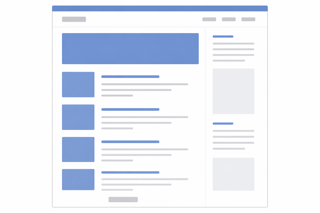
Detailed Information: https://juniortoexpert.com/en/what-is-the-f-pattern/
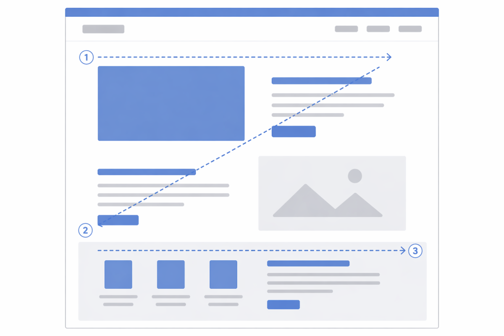
The Z-Pattern Layout
The eye travels from top-left to top-right, then zig-zags down to the bottom-left and finishes at the bottom-right.
- Purpose: To lead a user through a specific narrative ending in a Call to Action (CTA).
- Best For: Landing pages with a single goal (e.g., “Sign up now” or “Download the app”).
- Why it works: It mimics the path of a story, ending exactly where the “Action” button is usually placed.
Single-Page (One-Page) Layout
Instead of multiple URLs, all content lives on one long scrolling page, often using “jump links” in the menu.
- Purpose: To provide a controlled, linear journey where the user can’t get lost in sub-pages.
- Best For: Event invitations, simple product launches, or small business “business card” sites.
- Why it works: It’s mobile-friendly and ensures the user sees every section in the order you intended.
The Split-Screen Layout
The screen is divided vertically into two equal halves.
- Purpose: To provide a controlled, linear journey where the user can’t get lost in sub-pages.
- Best For: Event invitations, simple product launches, or small business “business card” sites.
- Why it works: It’s mobile-friendly and ensures the user sees every section in the order you intended.
The Masonry Layout
Elements are placed in columns of the same width but varying heights, much like a stone wall.
- Purpose: To display a massive amount of visual content without leaving “dead space” or awkward gaps.
- Best For: Visual discovery platforms (Pinterest), image galleries, and mood boards.
- Why it works: It encourages “infinite” browsing because the uneven bottom edges keep the eye moving downward.
The Asymmetrical Layout
A layout that avoids perfect balance, often using overlapping elements and “broken” grids.
- Purpose: To stand out, look “edgy,” and guide the eye through unexpected movement.
- Best For: High-end design agencies, experimental art sites, and avant-garde fashion brands.
- Why it works: It feels unique and premium, though it can be harder to make responsive.
Comparison Layout Types
| Layout Type | Primary Goal | User Experience |
| Bento | Organization | Clear, modular, and “gadget-like.” |
| F-Pattern | Information | High readability for text-heavy content. |
| Z-Pattern | Conversion | Directs the user straight to a button. |
| Masonry | Discovery | Best for visual-heavy browsing. |
| Split-Screen | Choice | Perfect for dual-intent or 50/50 focus. |
FAQs About Website Layouts
A Layout is the structural arrangement (where the boxes go), while a Template is a pre-designed file that includes the layout, colors, fonts, and often placeholder content.
They can be, but they require careful coding. On mobile, Masonry usually collapses into a single vertical column. If the order of the items matters, Masonry can sometimes make the sequence confusing on smaller screens.