Masonry Layout
Named after traditional bricklaying, Masonry arranges elements of varying heights into columns without leaving awkward vertical whitespace gaps.
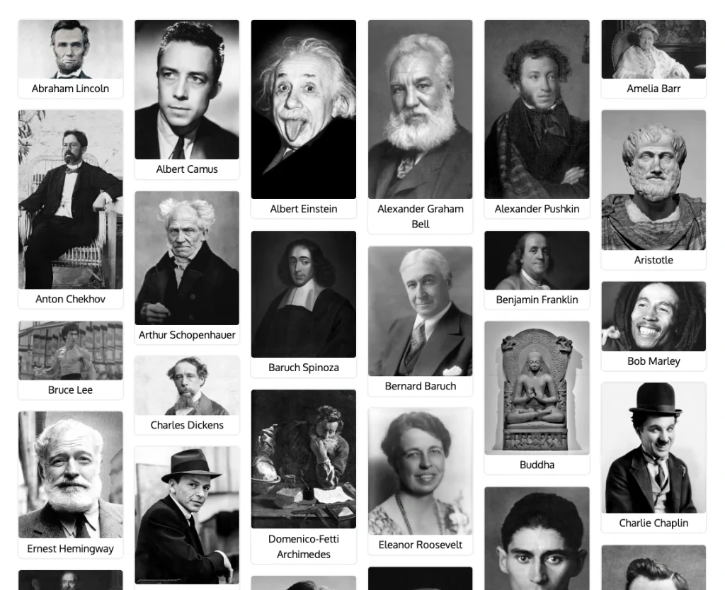
Traditional CSS Grid and standard CSS Flexbox rows force items into rigid horizontal alignment. When content cards have unequal heights (such as photos with different aspect ratios or editorial text excerpts), traditional rows leave large, unsightly empty vertical spaces beneath shorter items.
Masonry solves this by placing each upcoming item directly below the shortest column or automatically shifting elements upward to plug vertical gaps.
Webpages That Use Masonry Layout
Masonry layout is ideal whenever content items possess unequal vertical heights and benefit from visual exploration over tabular alignment.
1. Photography & Art Galleries
Platforms like Pinterest and Behance display portrait, landscape, and square images seamlessly without cropping or awkward whitespace gaps.
2. Editorial Feeds & Blog Excerpts
News outlets, digital magazines, and blog archives with varying excerpt lengths and headline sizes fit cleanly without rigid row breaks.
3. Testimonials & Social Proof Walls
User reviews, customer tweets, and case studies have different commentary lengths. A masonry wall displays them dynamically and authentically.
4. Dashboards & Note-Taking Apps
Applications like Google Keep and Notion database boards display cards with variable checklists, text, and attachments efficiently.
5. Creative Agency Portfolios
Design studios showcase branding projects, video stills, and mobile mockups in a rich, non-uniform layout that highlights diversity.
E-Commerce Websites: Most major e-commerce brands stick to standard, uniform grid ratios (1:1 or 3:4) on their main product catalog pages even when they feature mixed imagery because true masonry creates significant usability problems for online shopping.